Overview
There are several "listings" widgets available, which allow you to show a listing of content with various display options. The workflow for constructing Listings widgets is to build your content first (i.e., create Content pages, News items, FAQ items, etc.), and then select Listings widgets that will display your content as desired.
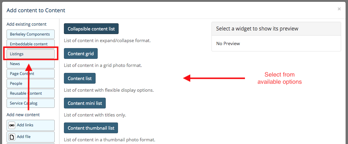
To select from the available Listings widget options, select the "Listings" tab when customizing a page, then select an item accordingly.
Teaser Text
The Collapsible Content List, Content List, and Content Thumbnail List widgets will automatically display some "teaser" (summary) text. If you would like to configure the teaser text that is displayed, you will need modify the summary of the original content items featured in the listing widget. See Edit Summary for more information.
Image/Photo
The Content Grid, Content List, and Content Thumbnail List widgets have options for displaying photos along with text. In order to add your own photos to these widgets, be sure to add a Featured Image to the content items featured in the widgets. If a featured image is not uploaded, a default image will be displayed instead.
The "Pager" Option
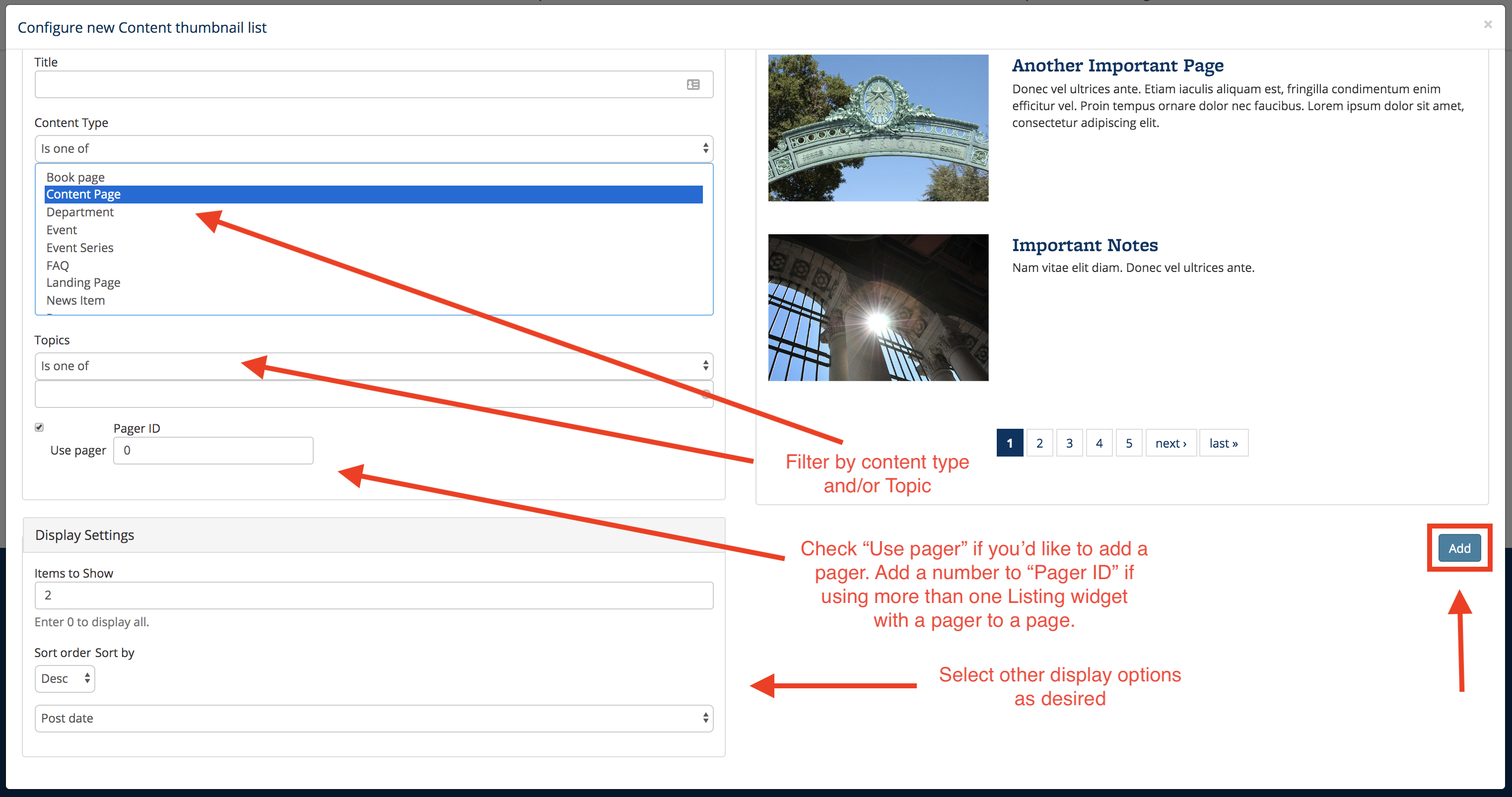
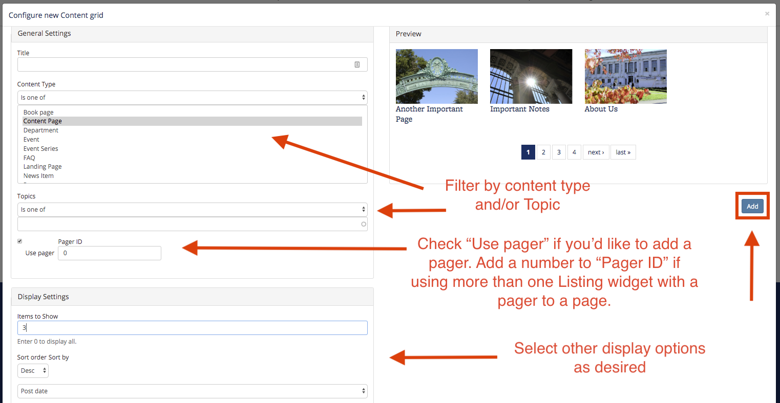
The Content Grid and Content Thumbnail List widgets have a "pager" option. When configuring the widget, the "Use pager" checkbox will be checked by default, and the pager will show up at the bottom of the widget if there are more content items available than the number of content items allowed in the "Items to Show" field. You can un-check this box to not show a pager.
Additionally, if you will be featuring more than one Listing widget on the same page, and if the multiple Listing widgets will each have a pager, then you will need to put a number in the "use pager" field (a number other than 0, such as 1). This will distinguish the pagers from one another, allowing site visitors to select from each pager. (If the number isn't added to the "use pager" field, then selecting a number from one pager will select the same number from the other pager as well.)
Collapsible Content List
The Add Collapsible Content List widget allows you to display a list of content in an expand/collapse format, with several different display and filter options:
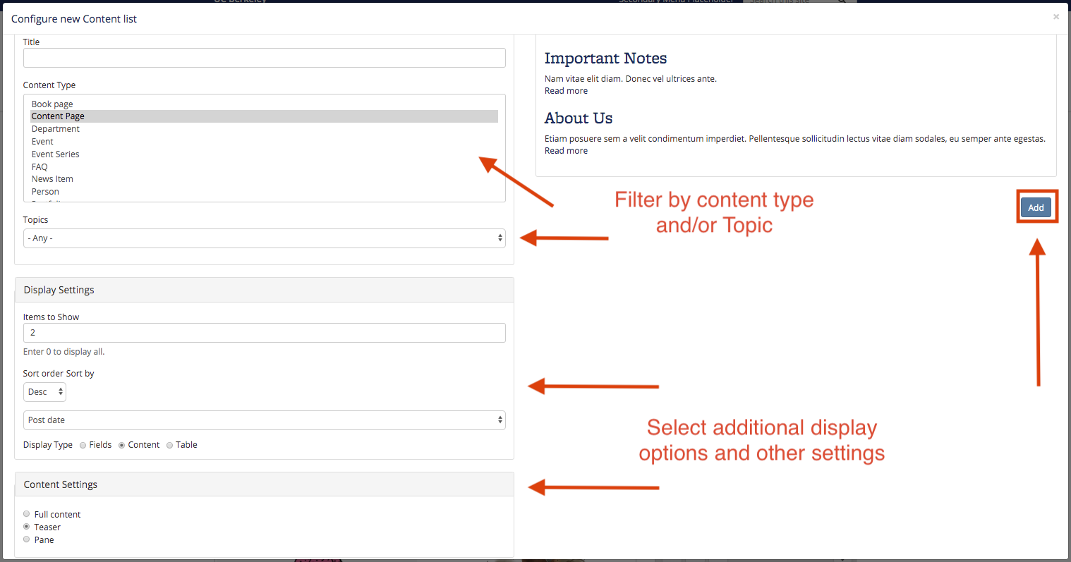
- General Settings: Add an optional title, and filter by Content Type and/or Sitewide Topic
- Display Settings: Add the number of items to show, and choose options from the “Sort order” and “Sort by” boxes.
To filter by Sitewide Topic, you’ll need to create the Topics and assign them to content items first.
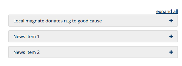
In the example below, three News items on any Topic are configured to be displayed in descending order by post date:

Once saved, the content will appear on a page in collapsed format:
To see an example of a Collapsible Content List in action, visit the "How Do I..." page in the Help & Training section of this site.
Important Note:
After saving both the widget configuration and the page customization, you may have to refresh your browser to see the items in the proper collapsed format.
Content Grid
The Content Grid widget will display a set of content items in a photo grid format, with a rectangle-shaped thumbnail photo and the title of the content item. This widget can be filtered by content type and/or sitewide Topic, with some additional display settings.
By default, the Content Grid widget will display the most recent 12 content items on your site. You can make additional configurations as needed (all configurations are optional): Add a title, filter by content type, filter by sitewide Topic (you'll need to create the Topics first and assign to content items), use or not use a pager, select the number of items to show in the grid, sort descending/ascending by title or date.
Content List
The "Add Content List" allows you to display of list of content in a widget area, with several display and filtering options available.
- General settings: Add an optional title, filter by content type, or filter by sitewide Topic.
- Display settings: Select number of items to show, choose options from "Sort Order" and "Sort By", and choose "Display Type."
- Field settings: These settings are available if the "Fields" or "Table" display type is chosen under "Display Settings."
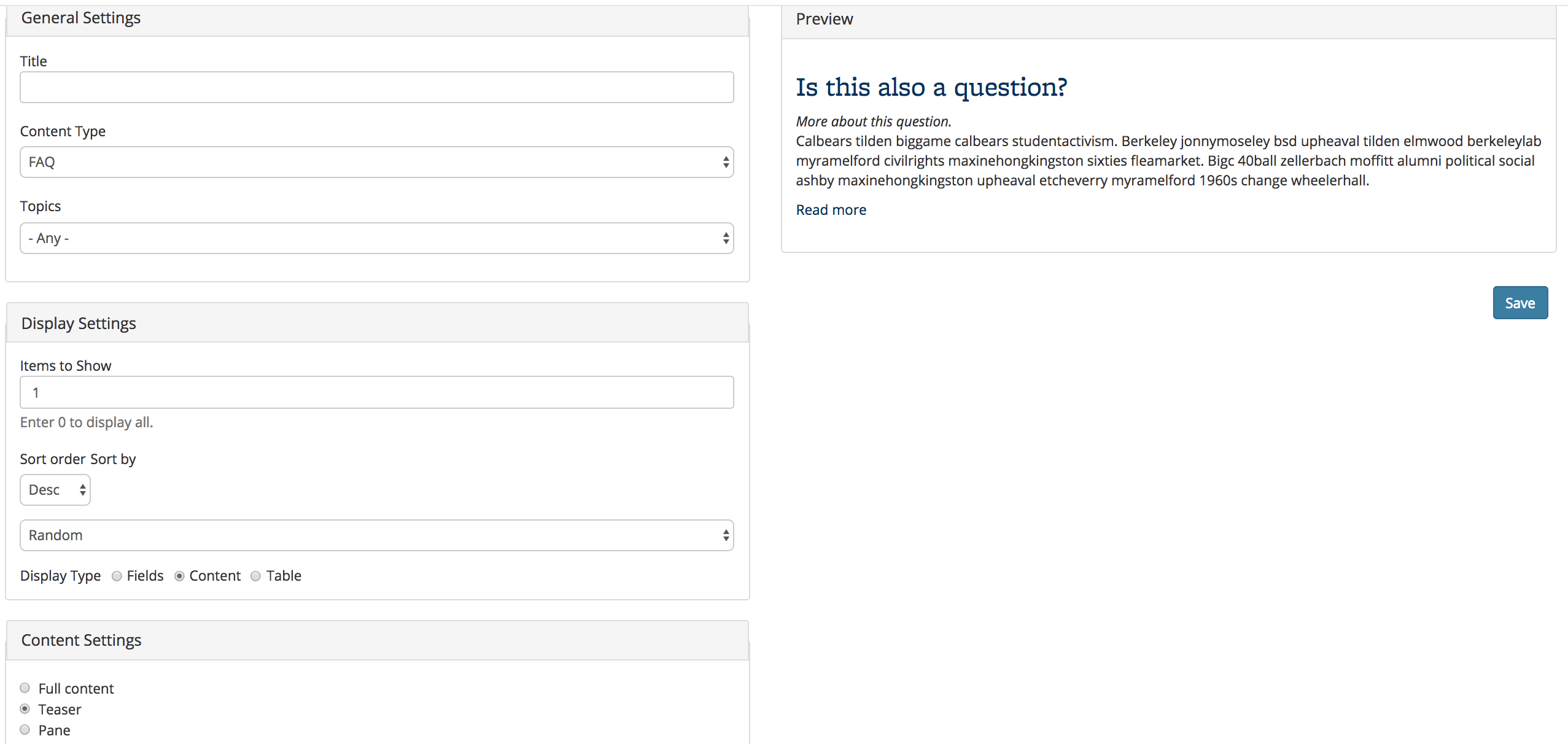
The following example displays the two latest content items, with "Content" select as the Display Type, with "Teaser" selected in Content Settings:
The following example displays a single, random FAQ.
Content Mini List
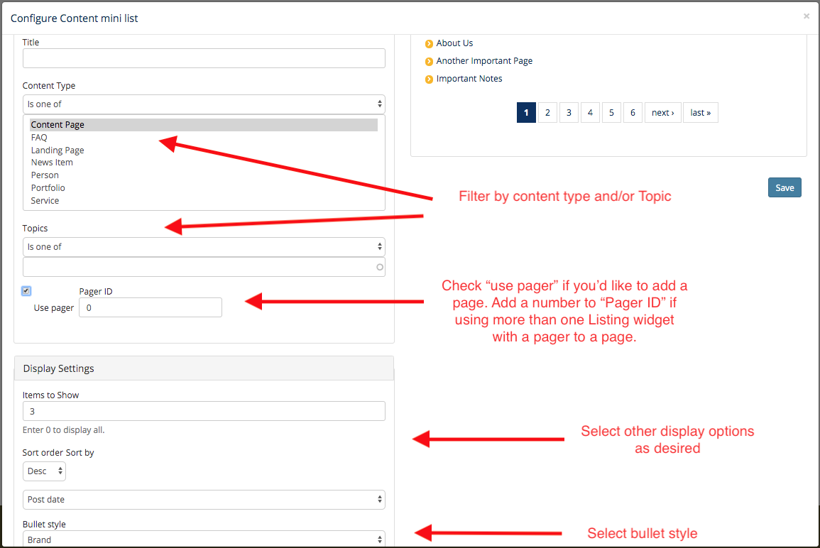
The "Content Mini List" allows you to display a linked list of content, with several list style and filtering options available.
- General settings: Add an optional title, filter by content type, or filter by sitewide Topic.
- Display settings: Select number of items to show, choose options from "Sort Order" and "Sort By."
- Bullet style: Select which bullet style should be used for the list of content
- "Standard" is a standard bulleted list
- "Brand" is a list with small arrows with a gold background as the bullets (like the Berkeley Brand optional list style)
- "Un-bulleted" is a list with no bullets
The following example displays the three latest Content Page items, with the "Brand" bullet style:
Content Thumbnail List
The Content Thumbnail List widget will display a vertical list of content, with a rectangle-shape thumbnail image aligned to the left of the title and some teaser text. This widget can be filtered by content type and/or sitewide Topic, with some additional display settings.
Like other Listings widgets, the Content Thumbnail List widget is updated automatically when content on your site changes or is added. There is also a Thumbnail List widget, which is meant to be used if you want to feature a specific set of content/links that should not change, or if you'd like to include both internal and external links.
By default, the Content Thumbnail List widget will display the most recent 12 content items on your site. You can make additional configurations as needed (all configurations are optional): Add a title, filter by content type, filter by sitewide Topic (you'll need to create the Topics first and assign to content items), use or not use a pager, select the number of items to show in the list, sort descending/ascending by title or date.