The Open Berkeley theme (design) supports the Berkeley Brand guidelines for web design. The Berkeley Brand guidelines are created and maintained by the Office of Communication and Public Affairs.
About the Open Berkeley Theme
The theme refers to the "look and feel" of the website: The fonts, colors, and other structural elements (e.g., the Berkeley wordmark, site name/banner region, and footer). There are a few theme settings available to Site Builders; see Theme Settings for more information.
If you have questions about the Berkeley Brand design elements, please contact the Office of Communication and Public Affairs: brand@berkeley.edu.
Responsive Theme
The Open Berkeley theme is responsive, meaning your website will "respond" (change) based on how it is being viewed (via desktop, mobile, or tablet devices). Open Berkeley Site Builders are encouraged to keep responsive behavior in mind when creating their content and pages.
- Widgets and layouts: When widgets are added to pages and organized using layouts, the widgets will follow a different flow based on the chosen layout, and the size of the mobile device. See Responsive Behavior of Widgets/Layouts for more information.
- Tables: All tables will change at smaller displays. The rows and columns will stack, and the text of the data cells will align with the corresponding text in the header cells. This behavior is dependent on properly-configured tables. All tables should have designated header cells, with table scope applied as well (both table headers and scope are also necessary for accessibility). See Responsive Tables and Add Tables for more information.
Brand Features and Widgets
The following features and widgets are available with the Berkeley Brand theme. These features provide site building flexibility, and supports the campus branding initiative.
Mega Menu
The default main menu display on Open Berkeley websites is a simple drop-down functionality. The Mega Menu option is an optional menu display, where the top-level menu item pops open, and features a photo and description along with the menu items. See Figure 1 (below), and see Mega Menu for instructions on how to use the Mega Menu feature.
Figure 1: Mega menu example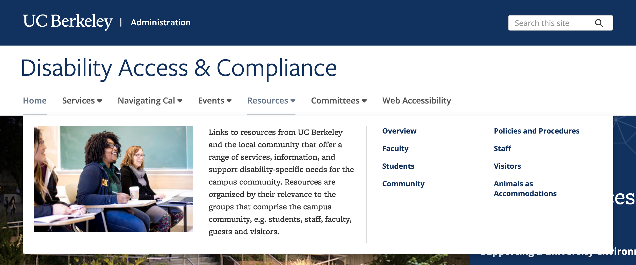
Hero Widget (full-width)
The Hero widget is a full-width image with text across the top of homepages and landing pages. The Hero widget has a few display options, and can feature videos and links. See Figure 2 (below) for an example of a Hero widget, and see Hero Widget for instructions on how to use the Hero widget.
Figure 2: Hero widget example
Color Bands (full-width)
A Color Band a full-width band of color with text that can be added to homepages and landing pages. There are multiple colors available for the Color Band. See Figure 3 (below) for an example of a Color Band widget, and see Color Bands for instructions on how to use. There are also optional HTML classes that can be added to Heading 2 text in non-Hero regions (e.g., in the "Body" field of a Content Page, or in a Text widget).
Figure 3: Color Band example
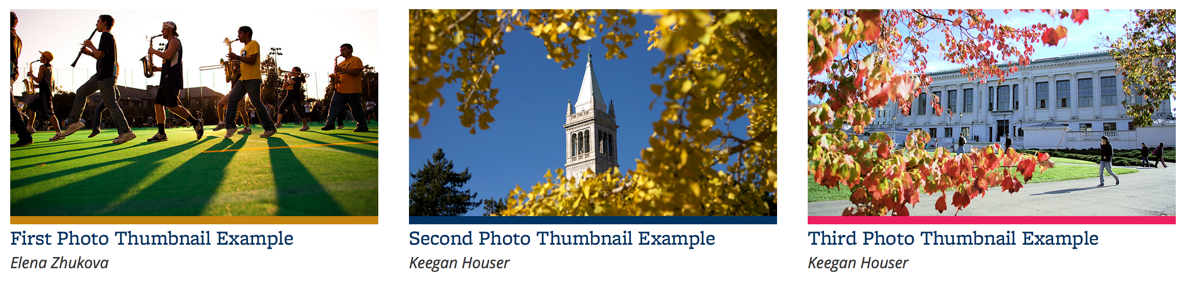
Photo Thumbnails
A Photo Thumbnail is a widget containing a photo with a thin color band (with multiple colors available) added to the bottom of the photo, and must be linked to either internal or external content. See Figure 4 (below) for an example of a Photo Thumbnail widget, and see Photo Thumbnails for instructions on how to use the widget.
Figure 4: Photo Thumbnail example
Promos
Promo block widgets feature 1 or 2 lines of text on top of a background color (there are multiple colors available). There are two types of promo blocks: Promo Block, and Promo Block with Image. See Figure 5 (below) for an example of Promo Block widgets, and see Promo Blocks for instructions on how to use the widgets.
Figure 5: Promo Block widget examples

Additional Brand Widgets
Additional Brand widget options include:
- Thumbnail List
- The Thumbnail List display is also available with the Listings widgets, People feature widgets, News Listings widget, and Publications widgets
- Quote
- Photo Thumbnail with Zoom
- Video Thumbnail with Zoom
- Berkeley Events calendar